
The STM in figures
Have you ever wondered which bus comes the most often?
Which one is fuller on average?
Which makes more stops?
Presentation: In this blog we are going to answer all these questions and much more, showing how we can use a historical record of sales data (in this case tickets), to obtain interesting conclusions, understand the current dynamics of the business and see what the main problems are to be addressed. All this through the generation of tables, graphs and animations that are both explanatory and attractive to the eye, to facilitate the understanding of the millions of data to be processed.
Available data: In this case, we are going to use the STM data on tickets sold, which are public and are published monthly here. Due to the massiveness of these (approximately 20 million tickets are sold per month, which means that on average for every two Montevideans, one travels on public transport daily) we are going to work with the data of a single month, in this case July of this year, 2022. Which prevents us from doing some interesting analysis, for example: Does the type of demand change by season? Are fewer tickets sold when school end? etc. However, it is necessary to be able to do an analysis that does not require much computing time or memory availability.
Now, referring to the data itself, we have a table that show us of all the tickets sold during the month, including the date and time the passenger bought it, which bus stop was, which line, the type of passenger, if it is a transfer, etc.
Next, we will see how we can use all this information, to convert 23 million pieces of numerical data into a series of graphs and other utilities, to summarize them and give them interpretability.
Two clarifications before beginning; first of all, is that we are going to use the term “tickets sold” for all types of tickets that are issued (including transfers or free tickets); and secondly, all the analyzes carried out will be based on the data for the month of July, although we do not mention it.
With that said, it’s time to start answering the questions we posed at the beginning.
Most popular lines: Let’s start by revealing the first big question, what is the line most used by Montevideans? How many people use it? To answer this, let’s see the following graph which shows us the 10 most used lines, together with the number of tickets that were sold in the month of analysis, July.
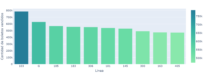
As we can see, the most used line is “103”, with a total of 790,000 tickets sold, a noticeable amount below, line “G” appears, with the amount of 630,000 tickets, and at the end, line “185 “with 570 thousand.
The first thing we can deduce is that the line “103” is the most widely used bus line, with a considerable difference compared to its immediate competitors, which are much more even with each other. Also note the great magnitude of these numbers, meaning that almost 2 million Uruguayans get on one of these 3 lines every month.
Just out of curiosity we can also see the opposite, that is, the least used lines.
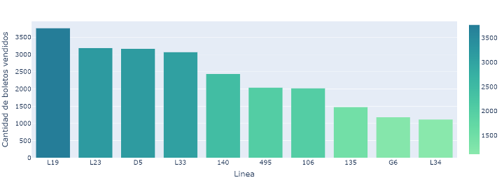
As we can see, the least popular are mostly local lines, such as line “L19”, or experimental lines, such as line “135”.
Another curious thing that we can look at is if this top 10 is the same every day of the week, that is, will there be lines that are used more on weekends? Are there buses that people only use to go to work? To try to answer these questions, we can rearm the first graph, but now differentiating by day of the week.
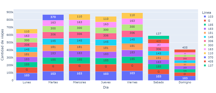
What we can see at first glance is that overall, the most used lines are the same every day of the week, except for the last position, where “307” or “110” appear during the week, while Saturday and Sunday “137” or “405” appears. One could try to interpret these results based on their routes. Perhaps the “405” appears on weekends as its destination is Parque Rodo, for example.
We already noticed that practically the global top 10 is maintained day by day, now we can see if it is maintained throughout the day, hour by hour. For this purpose, let’s see how the demand for these buses progresses throughout the day in the following graph.
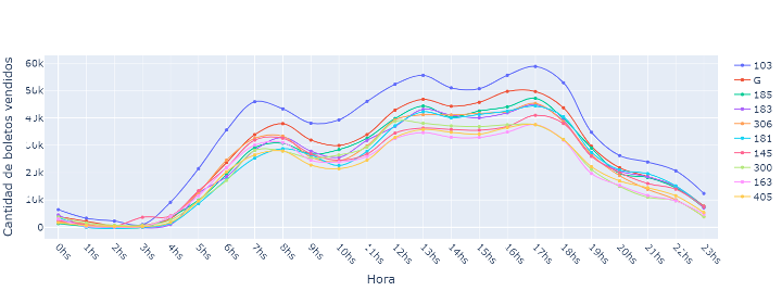
As we can see, in general all the lines at the top have the same behavior, very few trips at dawn (the number of vehicles is reduced), then it begins to rise progressively until it reaches a maximum at 7 o’clock (people go to work), then it goes down a bit and peaks again at noon (downtown areas are on the move), then demand stays high until it peaks at 5 p.m. (people come home from work), and then it starts to decline throughout the afternoon until nightfall.
The “103” maintains the wide advantage throughout the day, while others such as the “G” line are surpassed at nightfall. From this we could deduce that there are more popular lines at certain times of the day than others, which reflects that there are more crowded areas of Montevideo depending on the time of day, which generates these variations.
From these statistics, we can ask ourselves an interesting question: How distributed is the use of the transportation system in the different lines? In these cases, it is interesting to mention Pareto’s law, which is an empirical law that tells us that 80% of the sales come from the sale of 20% of the available products. Applied to our question, the law would say that 80% of the tickets are sold by 20% of the lines, while the other 80% of the lines only contribute to 20% of the sales.
To answer the question we can use a Pareto chart, which tells us, by taking a percentage of the lines, how much of the total percentage of monthly sales they represent.
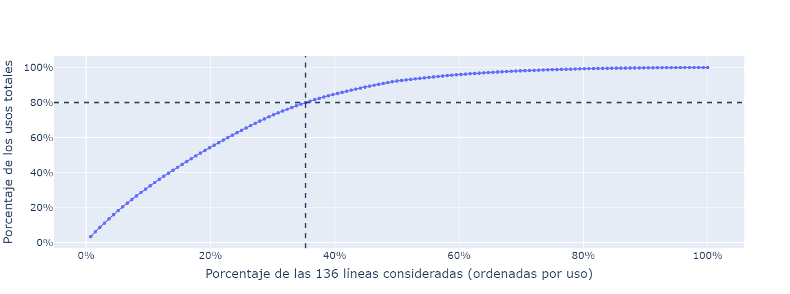
From the graph, we see how 80% of the sales are covered with 35% of the available lines. Which is more equitable than what the Pareto law proposes. Although it can also be said that, with half the lines, 92% of the total demand can be covered. Or also that 25% of the demand comes from the top 10 lines that we previously analyzed.
However, in order to draw direct conclusions from this type of analysis, we should assume that the population of Montevideo is uniformly distributed throughout the capital, which is categorically false, since there are very centrally located areas within Montevideo with high population and service density, and other areas with much lower population density and isolated areas. Because of this, lines will be necessary to provide service to these few (relatively) people in the periphery, generating the effect shown in the graph.
Busiest stops: In the same way that we can identify which were the most used lines, we can also see which were the most used stops during the month of analysis. Will they be part of the route of the most used lines? Will they be located in the central areas of Montevideo? Is there one noticeably busier than the others, as was the case with the lines? We can answer all these questions and more by analyzing the data on which stops the tickets were sold at.
Again, let’s look at the graph to draw the conclusions.
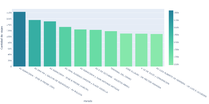
We can see that, with a considerable advantage over its competitors, the most used stop was Agraciada y Freire, in the area of the viaduct, one of the nerve centers of Montevideo. For example, the “G” line makes a stop here, which was the second most used line of the STM. Secondly, the Portones stop appears, the destination of the “G” line as well. Then Agraciada and Freire appear again, but now in the opposite direction, towards Belvedere. Then there are some notable ones, such as the Punta Carretas shopping mall, the Montevideo shopping mall or the Cerro terminal, where we can easily interpret why they appear in the top.
Beyond appearances, this analysis can be very useful to understand which are the areas of Montevideo with the most movement, to understand in which areas services, offices, etc. are concentrated. Also useful in this analysis is the fact that the data contains the date the ticket was issued, so we can also see how these areas vary throughout the day, understand if Montevideo behaves differently at night , if people are migrating from areas throughout the working day, etc. Although we are not going to carry out this in-depth analysis on the blog, we will use the time data to explore some particular cases, or as we did with the hours of greatest demand for the top lines.
Busiest hours and days: Taking advantage of the date and time data of the tickets issued, we can try to see which days are the busiest in the country’s capital, or at what times people use public transport the most.
For that, let’s see the following graph, which shows us the total number of tickets sold in the month, depending on the time and for each day of the week; and try to analyze it.
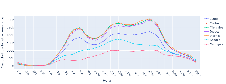
As we can see, the behavior per hour is relatively the same from Monday to Friday (the same that we analyzed when the most popular lines), and the number of tickets issued seems to be very similar on these days, except on Mondays, where we see a significantly lower amount. Why is this? Why Mondays are much more inactive? To answer this, we must remember that we are analyzing only one month, which had 4 Mondays, and one of them, July 18, was a non-working holiday, therefore, it is expected that very few tickets were sold on that day. compared to the other Mondays. Surely if we analyzed another month, we would see how Mondays would behave much more in line with the rest of the working days.
On the other hand, what is true is that there is much less demand on Saturdays and Sundays than on other days. Which makes sense since most people work Monday through Friday, although a lot of people work Saturdays as well, which is why Saturday looms large over Sunday, which is definitely the busiest day, because that’s when the big Most people take the opportunity to stay at home.
Another thing that we can see is how at night, the days with the most activity are Fridays and Saturdays, while, at dawn, Saturdays and Sundays. This can surely be interpreted as Montevideo’s nightlife, which occurs mainly on weekends.
The largest companies: Another brief but interesting thing that we can see is how the ticket sales are distributed by the different companies (CUTCSA, COETC, UCOT, COMESA). For that let’s look at the following bar graph.
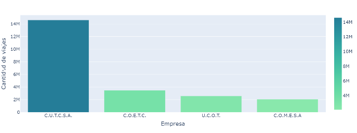
We can clearly see the superiority of CUTCSA, which accounts for about 64% of the market. On the other hand, the rest of the companies, among which the remaining 36% of the demand is distributed, have a similar participation.
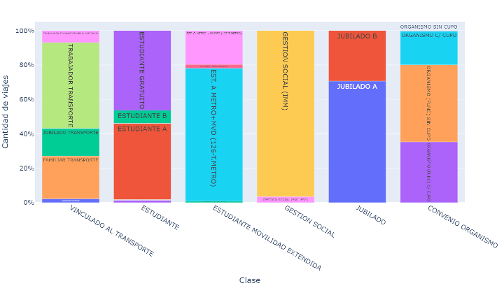
Distribution of users by categories: When STM cards are issued, there are various categories of them, for example, students, retirees, common users, etc. In the following table we can see how these categories are distributed.
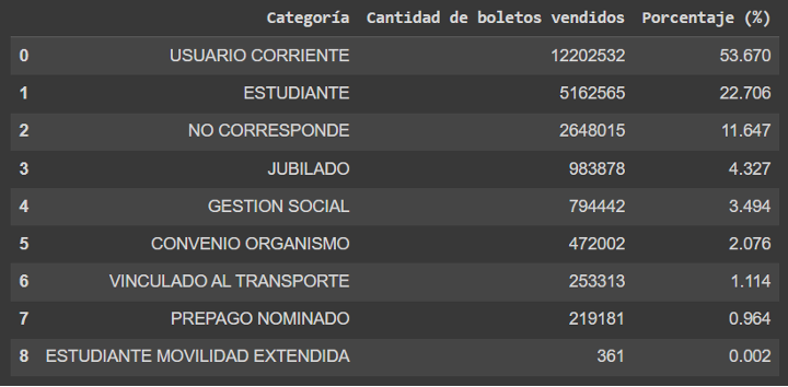
As we can see, most of the tickets are issued to common users, these being a around half of the total consumption. Then the students follow, with an important percentage. Then the “NOT APPLICABLE” category appears, in which are those users who do not use the card and pay in cash. Then we see the retirees and other categories.
It is important to note that in these cases where there are much smaller values than others, it is convenient to use tables instead of graphs, in order to correctly appreciate the magnitude of these values.
One thing we might ask ourselves is, are these percentages the same throughout the day? For that, let’s see now if the following graph.
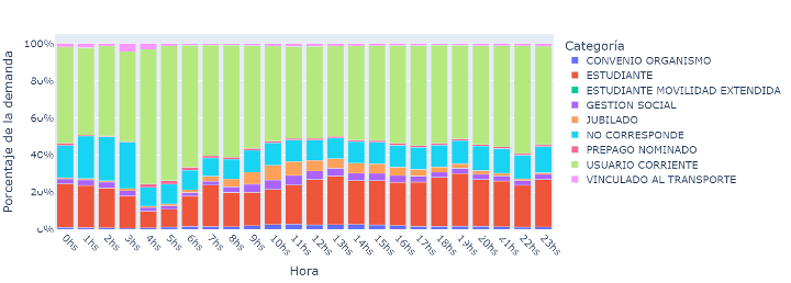
Where we can see how the representation changes throughout the day, for example, common users are always the majority, but especially at dawn, where students reach their minimum representation during the day. We can also see other curious things, such as the fact that those linked to transport are almost nil throughout the day except at 3 in the morning, where they have a considerable percentage.
Exactly the same analysis can be done for the days of the week. Could it be that the student representation is greater from Monday to Friday? And what about retirees? For that, let’s look at the following graph.
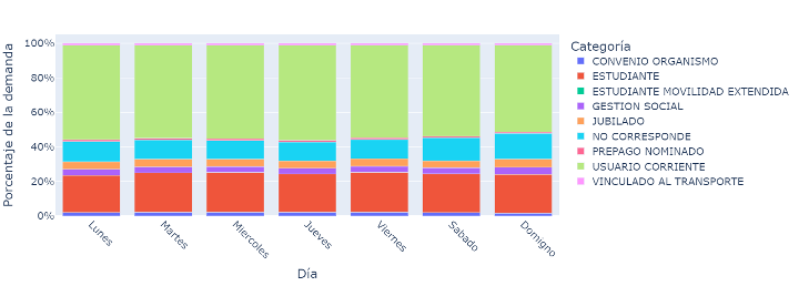
We can then see that, despite our expectations, there are no significant changes throughout the days, always maintaining the same proportions, what is good to highlight.
Although we have been analyzing these 9 categories, they are divided into different subcategories, for example, free or not free students, class A or class B retirees, etc. Although there are also categories such as common users, which are not subdivided. Considering this, let’s see a graph of how these subgroups are distributed within their category.
From here several analyzes could be made, but for that one would have to understand what each category means, and what criteria they use to segment users; which is irrelevant in this analysis. We are going to stay with more trivial things, like the fact that students who travel for free are approximately half of the total number of students, or that most of the users that appear as “LINKED TO TRANSPORT” are the same transport workers.
Finally, let’s ask one last question based on the categories, which we already associate with the days, with the time, and we did not do it with the lines. Could it be that there are lines where more passengers of a certain category travel than others? For example, which lines have the highest percentage of students? And in which less?
To answer that, let’s look at the following table, where on the left we see the 10 buses with the highest percentage of tickets issued for students, and on the right the 10 with the least. Note that to create the table, the local lines with few users were omitted in order to obtain more robust and significant results.
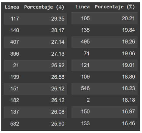
First of all, let’s see that the line with the highest student representation is line 117. We could try to interpret this result based on the path of the line. For example, we know that its route goes through several faculties, such as law, engineering or economics, architecture or psychology, and it also passes through some large high schools such as IAVA or Zorrilla.
Let’s note that line “117” reaches almost 30% of students, while the global representation we had seen was 22%. Then follow other lines with a similar percentage, such as “140” or “407”.
On the other hand, the line with the least representation is 133, with only 16%, a similar amount below the average, then “117” was above.
This type of analysis, carried out in greater depth and considering the time and day, would help us to understand how students move around Montevideo. With this we could deduce how decentralized are the educational centers in the city. It could even give us indications of in which area to build new ones, to facilitate access to it.
Use of transfers: One possibility offered by the STM is that of transfers, which consists of concatenating several trips on different lines for the price of a single ticket, provided that these trips are made within a certain time.
The most usual thing is that the people who use the transfers are on two trips, however, there is no limitation on this and other people use it more times. This leads us to some questions, for example, how common are transfers? What was the transfer with the most trips?
To answer this, we are going to use one of the data that we have available, which is the transfer number that is registered with each ticket issued. From this we can create the following graph, where we see the number of transfers per number of trips.
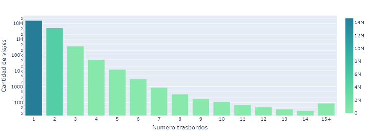
Let’s first note that the graph is on a logarithmic scale, a way of graphing very large and very small values at the same time. Either way, we can also make a table by adding the percentages.
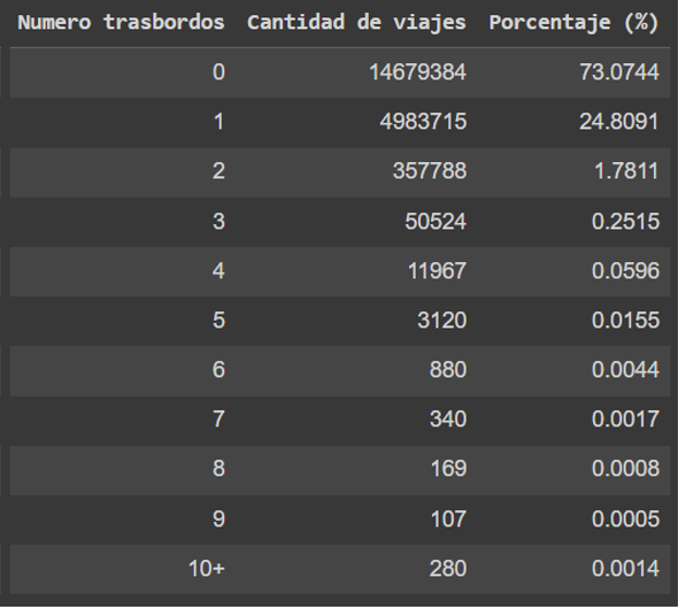
From these two figures we can see how most people do not make transfers, and of those who do, the vast majority do so only once. We see that very few make several transfers, however, there are some people who manage to do more than 10. But how much was the record for transfers in the month of July? Well, the record is… 24 transfers. We can even see that the person who did this was an common user, with a 2-hour ticket. Surely these people who make several transfers are street vendors or those who go up to sing and/or play; who get a 2-hour ticket and go from bus to bus for the duration of the ticket.
The fastest, and the slowest: Everyone has ever felt that the bus they are waiting for takes a long time to pass, and that it should do so more frequently, or that a certain other bus passes very often for the few people it carries.
That is why in this section we are going to try to analyze some issues related to the frequency with which the different lines pass (something we had not seen until now), and how many people move in comparison.
To answer these questions, but also generate others, let’s look at the following graph. In it we represent the 10 lines that used the most times in the month, along with the total number of passengers they had.
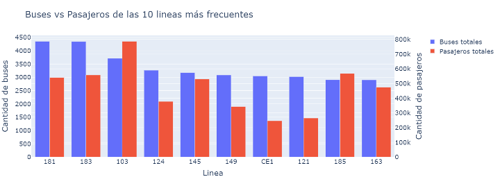
First, let’s note that while some lines do reappear, it’s not the same top 10 we saw when we looked at tickets sold. We also see that the bus that passes the fastest is “181”, followed by “183” and “103”, which was the one used by the most people. Then we can also see that the bus-passenger relationship is not the same for all lines. For example, it could be said that on average the line “181” is emptier than the line “103”, since their passenger-bus ratio is lower. To see this relationship in greater detail, let’s look at the following graph, which shows the lines with the highest and lowest passenger-bus ratio.

We see, for example, that the busiest line on average is line “G”, with approximately 60 passengers per vehicle (it does not mean that 60 go at the same time, but that on average 60 people get on throughout the trip). We also see that the lines that are emptiest are the local lines, with about 10 passengers per vehicle on average. This data on local lines is closely related to what we discussed when we talked about the Pareto relationship, which was related to the centrality of Montevideo and the distribution of services and infrastructure.
Another thing we can do is mix this information with time to see how the number of buses running changes throughout the day. How well will it correlate with demand? For that, let’s see the graph that shows us precisely the passenger-bus relationship throughout the day.
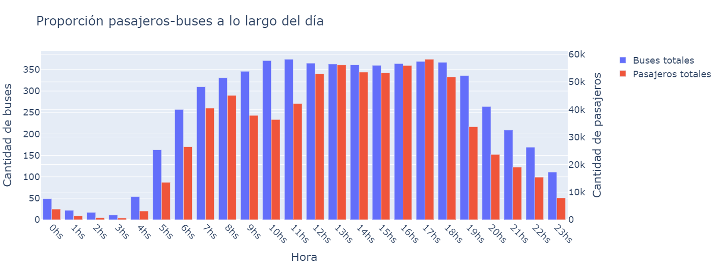
In the red bars that represent the passengers per hour, we see the same trend that we already analyzed previously. In the blue ones, which are the buses in circulation per hour, we see a behavior similar to that of the passengers, but with some differences. The main difference is that while the quantity of demand decreases in the period from 8am to 12am, the circulation remains constant in that same period.
In general, we could say that the circulation increases sharply from 5am, to reach a constant level around 10am, where it is maintained until 7pm where it begins to gradually decline.
Some conclusions that we could draw are that, for example, since circulation is constant from 10am to 6pm, but not the number of people using public transport, buses will tend to be more crowded in the afternoon than in the morning.
Does this mean that the frequency should be reduced to hours like 10am, to raise it to others like 6pm? This is not necessarily the case because many other factors are involved that we are not considering in this analysis. We must also consider the behavior of each particular line, the geographic coverage, not leaving anyone without coverage, etc.
A particular analysis: As we have been saying, more complex analyzes could be done by combining different analyzes that we did. To close the blog, we are going to show an analysis of a particular line, for example, line “199” (Punta Carretas-Cementerio Norte). We are going to try to see how the use of the different stops on its route evolves throughout the day. Are the most used stops always the same? Is there a stop that is only used at a certain time of the day?
In addition, we are going to show another data visualization tool that is animations, which allows us to add more information, usually temporary. Let’s see then the following animation which shows us how the use of the stops evolves throughout the day (we only consider the stops on the outbound journey).
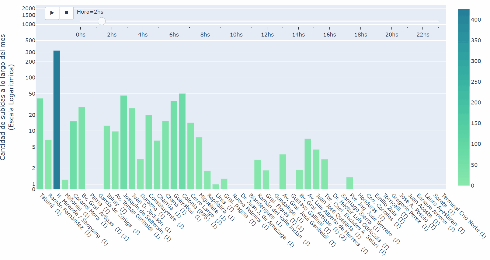
In general, we see that the busiest stop is “H. Miranda”, i.e. the Punta Carretas shopping mall, however, we see how it is not until midday when it is consolidated as such, while in the morning it is not as used as others. Then we can also see how the area of origin (Punta Carretas) is always more crowded than the destination area (Cementerio Norte), which makes sense considering that Punta Carretas is one of the neuralgic points of Montevideo. We can also see that there are stops that are always less crowded than their adjacent ones, or that there are others that oscillate throughout the day, or some that have a group behavior, among many other things that we could see and interpret from the animation.
Conclusions: As we said at the beginning, the objective of this analysis was to answer some questions that we all asked ourselves at some time, in addition to serving as an excuse to show the potential of tabular data analysis through graphs, tables, and animations. Beyond that, one may be tempted to think about possible improvements or optimizations of the STM that could be made based on what has been seen. However, it must be considered that managing a system on which the majority of the population of the country’s capital depends is not so simple; therefore, we must be cautious with the conclusions we can draw, remembering that there are thousands of variables to consider when analyzing these things, as we have commented on some occasions. But this does not mean that these analyzes cannot be used to make significant improvements; as long as they are focused on the correct way, being clear about what is being sought and not simply exploring the data; interesting results can be reached that result in system optimization.
Also remember that, although throughout the blog we focus on the STM data, we must not lose the general vision that this type of analysis can be performed on almost any set of data structured in this way. Thus, being able not only to visually understand the data, but also to understand key factors of the system and even to optimize it.