
Iceland, the country with almost 100% renewable energy, and other curious facts about world energy consumption
Objective
The vast amount of information available nowadays has started a tendency of data analysis and exploration with the goal of gaining insights in order optimize business decision making. The first step to make the most of it is to understand it: to comprehend what information it holds (and what it doesn’t), observe how its behavior evolves over time, detect possible patterns, and even more.
Throughout this process, which is not easy and often proves to be the most demanding step, there are various tools that can assist us. Amongst them, the most basic yet simultaneously the most valuable one is data transformation; the process through which those initial digital records are turned into visual information, information we can comprehend at first glance. This process, known as Data Visualization, involves visually expressing the information within the data.
In this field, the main challenge lies not in the technical aspect but rather in understanding which visual structures are ideal for conveying our intended message, using the data as our source. It’s important to emphasize that there is no “truth” in data because what the data “reveals” will always depend on how we manipulate it.
Our Case Study
To start this journey, we first need a dataset to work with. We will be utilizing the Kaggle dataset titled “World Energy Consumption “, which contains data on global energy and electricity consumption from the past few decades, categorized by country and source.
As mentioned, one of the initial steps is to comprehend the data we are analysing. In order to do that, we will begin by understanding the difference between energy consumption and electrical consumption. For instance, the fuel consumption of automobiles falls under energy consumption but not electrical consumption. Therefore, it is enough to understand that all electrical consumption is a subset of energy consumption, but not the other way round. Once this clarification is made, let’s start our analysis.
Historical Consumption
One of the first things we can observe is how energy consumption has evolved worldwide throughout history . As it is evident that consumption will continue to grow as the population increases, we should also analyze per capita consumption to avoid this issue.
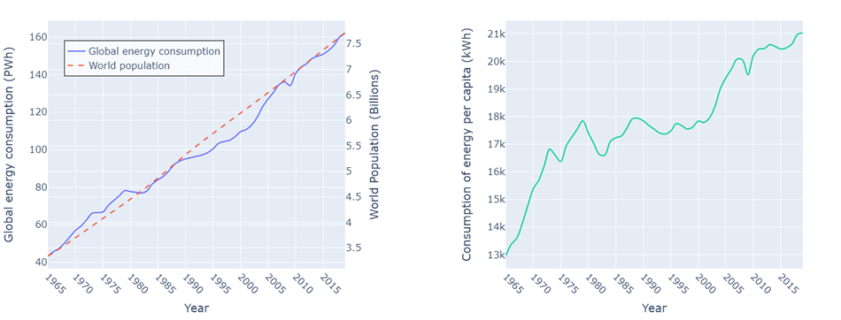
It’s always a good practice, after creating a graph, to check if it aligns with the expectations of reality. In case it doesn’t, we should be able to understand why (which could be due to improper data handling).
As we expected, we see how consumption grew paralelly with populationm, in the graph on the left
Then, on the right, we observe something much more interesting and not so obvious: per capita consumption also increased, despite certain irregularities. Broadly, we can see that we now consume approximately 80% more than we did 50 years ago. At some point during the 1980s people’s consumption decreased, and then at the beginning of the 2000s, there was a sharp growth that has continued to this day. Explaining these events would require further analysis beyond the scope of this study.
The Influence of GDP
We can think of energy consumption as a reflection of the level of industrialization—more industries, more consumption. It’s also associated with the comfort level of individuals because greater comfort requires higher consumption. Therefore, it’s interesting to contrast how GDP (Gross Domestic Product) evolved in comparison to energy consumption, both globally and per capita.
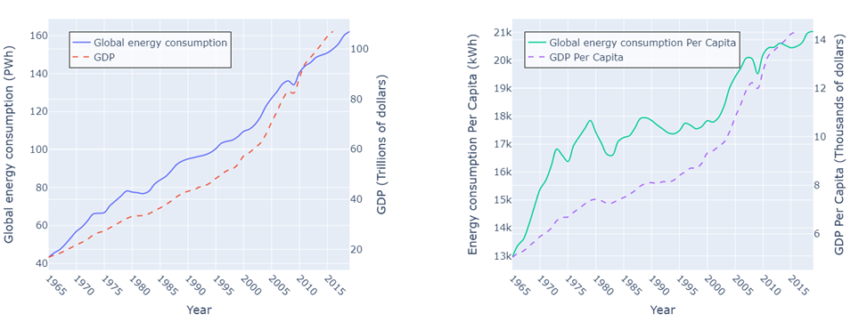
Firstly, with the graph on the left, we observe something we expected: energy consumption increased in line with GDP (at least on a global scale, which is our current focus). This relationship is associated with industrial growth, one of the factors we were interested in. An interesting point to note is what happened in 2009, where both indicators dropped (likely due to the Great Recession).
When analyzing the graph on the right, we can see that, overall, people’s energy consumption grew in parallel with their GDP, which is linked to the comfort level we mentioned earlier.
At the Continental Level
Up until now, we’ve used global consumption to get an initial look at the data. However, it’s time to delve deeper, not yet by individual countries but by continent (or regions). We will examine historical consumption, much like we did before, but this time broken down by regions, now taking advantage of the opportunity to showcase a different type of visualization for the same data.
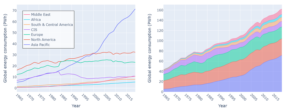
First, let’s see how we use two types of visualizations for the same data, even if they don’t convey the same information. The first emphasizes the specific evolution of each region, making it easy to compare them. For example, we can see a significant growth in Asia in recent decades, surpassing North America, which had the lead in energy expenditure until the beginning of the current century. Asia even doubled North America’s energy consumption in less than 20 years.
On the other hand, with the second visualization, we see how each region contributes to a total and in what manner. We can observe, for instance, that approximately 80% of global consumption originates in Asia, North America, and Europe. We can also notice how Asians were the primary drivers of increased consumption in recent years.
Segmentation by Country
Continuing to refine our level of granularity, we can perform an analysis at country level, focusing on the top 7 countries with the highest energy consumption. We will create a couple of representations similar to what we did previously.
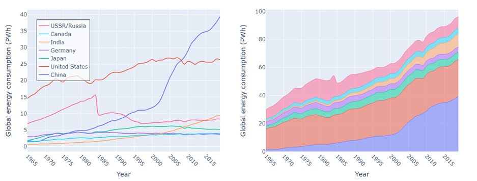
At a general level, we see something that could be inferneced from the previous analysis: China was the primary driver of Asian prosperity. While its growth was steady and comparable to other global powers, it was at the beginning of the century when its growth skyrocketed, placing it in the position it holds today, 20 years later.
We can also detect emerging economies that are growing exponentially, such as India.
Furthermore, historical events can be identified, such as the collapse of the Soviet Union, during which energy consumption plummeted. This was in part due to the separation of other Soviet countries from Russia, although there was also a subsequent energy decline in what remained as Russia.
Renewable Energy
As we mentioned at the beginning, the dataset we are using contains information about energy sources. Therefore, we can analyze what has happened with renewable energies in recent years. Thanks to technological advances and cost reductions, many countries have made significant changes in their energy matrices, paving the way for new and sustainable energy sources.
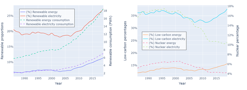
In the graph on the left, we see several things. Firstly, we apprecieate the evolution of the percentages of renewable energy and electricity in recent years, and then the same comparison but in absolute values. The first thing we notice is that the rates of electricity generation from renewables are always higher than those for energy consumption as a whole. To understand this we need to remember that energy consumption that is not electrical mainly comes from burning fuels (for example, in combustion engines or furnace heating). Since most fuels come from non-renewable sources, this imbalance occurs, resulting in lower rates for renewable energy compared to electricity. In contrast, major renewable energy sources (such as dams or wind farms) are directly converted into electrical energy.
Furthermore, we can see that while renewable energy generation has grown significantly, it wasn’t until the mid-2000s that its proportion in global generation began to increase, with a growth of about 5 percentage points to date.
Finally, the graph on the right attempts to show that by adding nuclear energy to renewable energy, we get what is known as low-emission generation. Although nuclear energy is not renewable since it consumes finite minerals, it produces very few emissions compared to other non-renewable generation methods. From this graph, we can see how the decline in the use of nuclear energy in the 2000s led to a decrease in the proportion of electricity generated without emissions.
Most Sustainable Countries
As we’ve seen, we can segment by country and also by the type of energy source. This invites us to cross these two dimensions and analyze the type of consumption by country. First, let’s focus on simply identifying the countries with the highest rate of renewable energy consumption. Remember that currently the global percentage of renewable electricity is 27%. Let’s take a look at the standout performers.
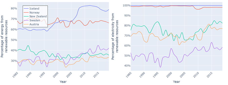
On the left, we see the rates of renewable energy consumption, and on the right, the rates for electricity.
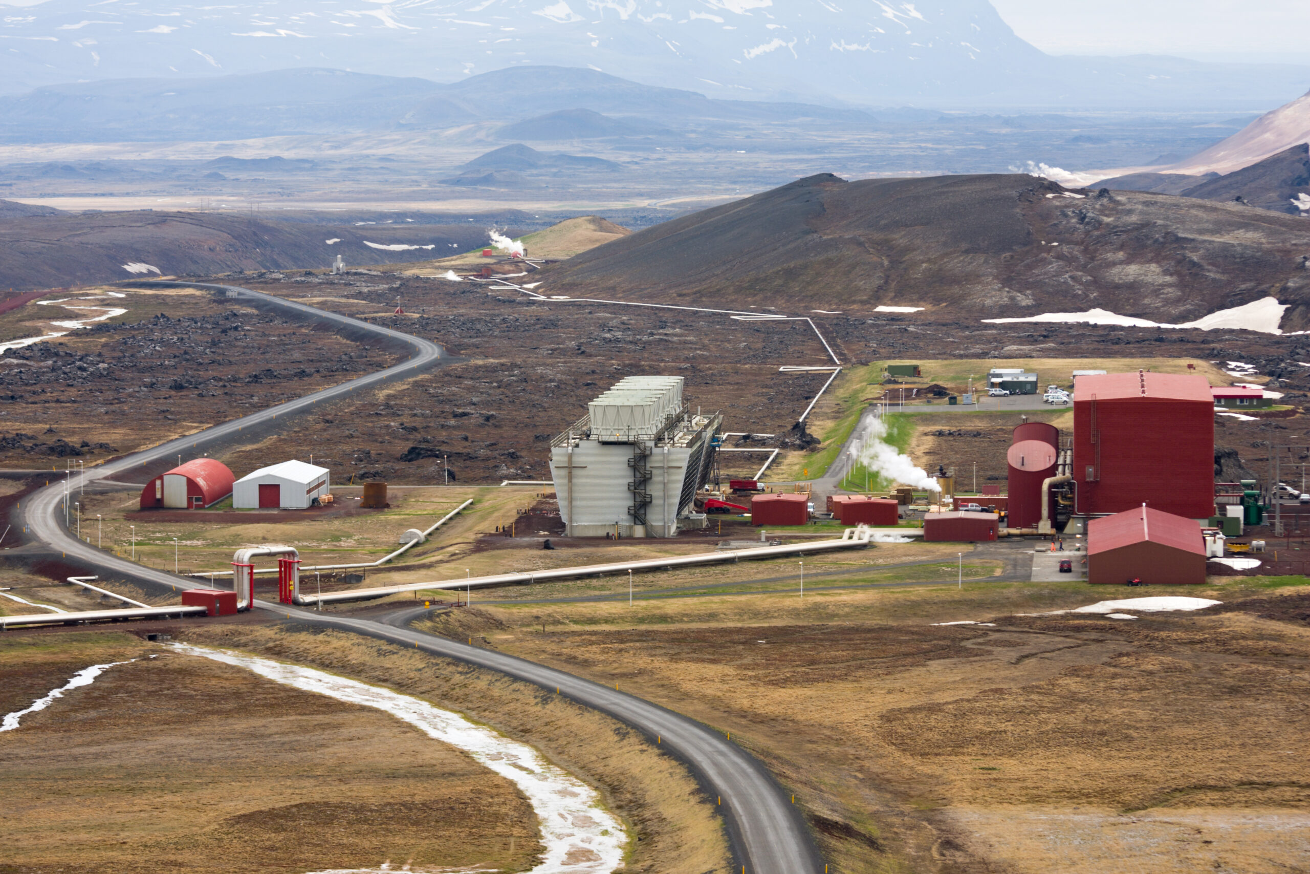
Analyzing by country, we can see that Iceland stands out significantly, reaching 80% renewable energy consumption in the last decade and 100% sustainable electricity generation. The difference between 100% and 80% can be explained, as we discussed earlier, by non-electrical consumption, such as fuel for vehicles. It’s essential to keep in mind that Iceland has a very low population (less than 400,000 inhabitants), so this case cannot be extrapolated to large populations.
Next is Norway, with almost perfect behavior, and further down the list are other countries with rates close to 40%, a value much closer to the global average.
There are some important considerations to highlight. For instance, this dataset has insufficient information for some Latin American countries, where there are also very high rates of renewable energy use. Additionally, as we previously pointed out, it’s easier to maintain a high rate in countries with small populations, limited landmass, and low production capacity than in major powers, which likely have rates below the global average.
Types of Renewable Energy
Now that we’ve analyzed energy as renewable or non-renewable, we can dissect it and see which are the primary sources within each group and how they have evolved in recent history.
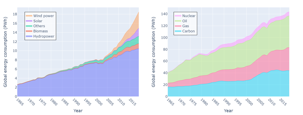
On the left, we can see the sources of renewable energy. As a primary conclusion, we notice that by a wide margin, the most common source is hydropower (i.e dams). This can be explained for several reasons. Firstly, it’s the easiest resource to obtain since building a damionly takes a flowing water source with sufficient flow. Secondly, it can provide a substantial amount of power because it allows us to convert all the kinetic energy from the flow into electrical energy. Finally, and very importantly, it’s controllable. Unlike a windmill, where we have no control over the wind that makes it spin, in a dam, we can open the floodgates when we want, allowing us to supply the desired power when needed (provided there is water in the dam).
If we conduct a more detailed analysis we can see how wind energy experienced exponential growth since the early 2000s, becoming the most common source after hydropower.
On the right we have non-renewable sources, where we can see that, in broad terms, fossil fuels (natural gas, oil, and coal) share proportions, leaving nuclear energy behind.
On a visualization level, we can see that with this type of stacked values plots, it is easier for us to observe the behavior of the total alongside individual categories. This can be useful as it provides information, but it adds a challenge when we want to compare different categories. This is why it can be helpful to normalize the values per year and look at percentages. (This normalization makes sense because we’ve already seen the overall behavior in previous sections, and repeating it now it may seem redundant.)
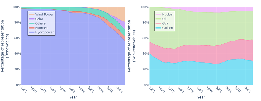
Now, with this visualization, we can clearly detect patterns such as fossil fuels approximately maintaining the same proportion over the years (except for the growth of natural gas). We can also observe the emergence of nuclear power in the early 1970s.
On the other hand, in the renewables category, we see how the dominance of hydropower has been declining since the 2000s due to the appearance of other sources such as wind and solar power in the market.
Geographic Visualizations
Another good idea when working with country-specific data is to use maps to display our data. This type of graph is especially useful because it provides us with a geographical context for our data, allowing us to detect relationships that would be otherwise challenging to discern. Additionally, it allows us to represent more data on the screen.
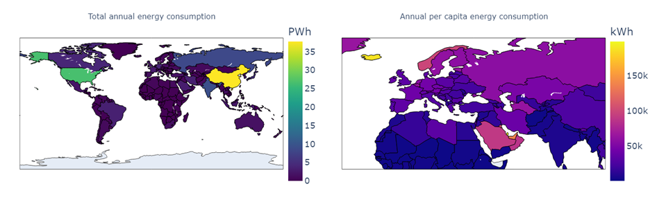
In these maps, we take the opportunity to show both absolute and per capita consumption, as we’ve seen before, but now for the entire planet. The graph on the left, as it shows absolute values, helps us see how China and the United States are the major consumers, with the rest significantly below.
On the right, we see per capita consumption, which allows us to appreciate more details that were overshadowed by the major consumers before. For example, we can see (if we zoom in) that Qatar has the highest per capita consumption, followed by Iceland (likely due to heating), and then the United Arab Emirates.
These maps are especially useful when we remember that these consumption measures are associated with a country’s level of comfort and industrialization. However, that analysis goes beyond the scope of the blog.
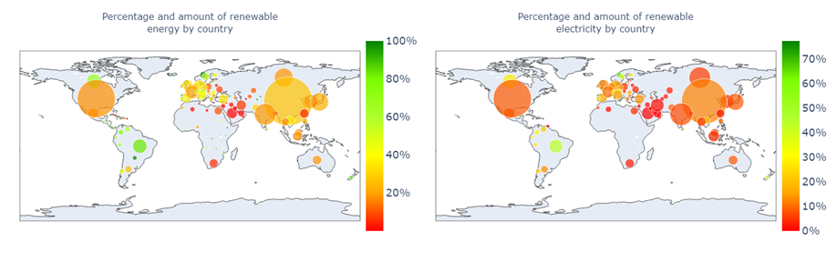
Similarly to how we handled consumption, we can also map renewable energy and electricity rates. In this visualization, we add another dimension, which is consumption itself, represented by the size of the bubbles, while the color of the bubbles indicates the renewable rate.
A quick glance confirms what we assumed earlier: major powers tend to have lower renewable rates. This is evident when we see that the smaller, greener bubbles tend to represent countries with higher renewable rates.
By Country and Source
Finally, to conclude the blog, we will cross-reference the two segmentations in our dataset to analyze different energy sources by country in the current era (now leaving historical data aside). For this, we will present three different ways to visualize this data, analyzing the advantages and disadvantages of each.
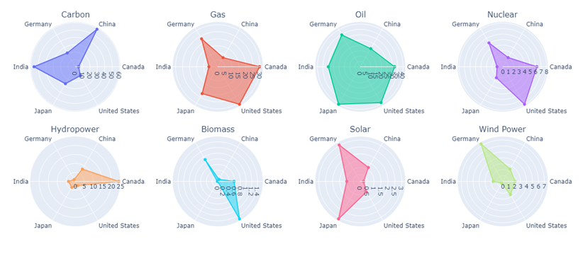
First, we have the option of creating a radar diagram for each energy source. In this representation, we see, for each energy source, what proportion it represents (as a percentage) of each country’s energy supply. It’s important to note that using the proportion of that source in the country allows us to compare countries with different populations. Conclusions we could draw from this representation might include, for example, that wind generation is particularly important in Germany, hydroelectric in Canada, or biomass in the United States. The drawback of this visualization is that we don’t have a sense of absolute consumption, which can lead to misunderstandings, especially when comparing countries with disparate populations.
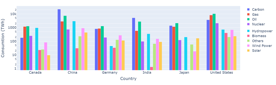
The second option is grouped bar charts (which can be thought of as several bar charts with a common reference), where we regain a sense of absolute consumption. However, we need to resort to a logarithmic scale to visually equalize the consumption levels of the countries being analyzed. In this case, we group the data by country, making it easier to analyze each country’s energy mix. Now we can draw conclusions associated with absolute consumption as well. For example, China is the largest consumer, and its primary sources are coal, followed by oil. We can also see that in India, the use of biomass is much less developed compared to the other countries we are visualizing. Here, we also face obvious disadvantages. Essentially, when using a logarithmic scale, we can no longer make proportion comparisons as we did before and must limit ourselves to ordinal relationships, such as “greater or less than…”
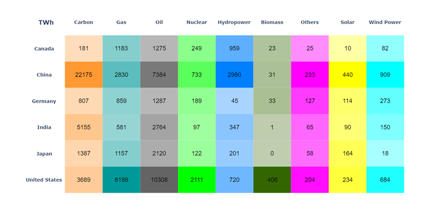
The third and final proposed option is a color-coded table. In this case, we use a two-dimensional table to represent our data, and we use color to identify the proportion at the source level. Additionally, we annotate the specific value in each cell to know the absolute value. In this visualization, we can see the proportions of each source for each country using color, the same information as in the first representation, but now we can also see the absolute consumption value. From here, we can confirm or reinforce some of the observations we made in the previous representations. For example, the United States is the country that makes the most use of biomass. We can also see that while Germany had the highest proportion of wind generation (in absolute values), it is well below wind generation in countries like the United States or China; which is logical considering their populations.
While this way of presenting data attempts to correct the shortcomings of the previous ones, it also has its disadvantages. These include the fact that visually comparing colors is more challenging than comparing distances or numbers. Unlike the other tools we showed that aimed to convey information quickly and visually, this plots are less visually appealing than the others and require more reading.
Summary of What We’ve Learned
As a conclusion, let’s summarize what we’ve learned in the blog. The key takeaway is that there’s no such thing as a perfect graph that can display all the information and complexity of our data. We always have to make trade-offs and sacrifices in visualization. That’s why it’s essential to have a clear understanding of what we want to convey, so we can decide what to include and what to omit.
We’ve also seen that there are various types of graphs that can represent the same information but in different ways. Therefore, choosing the best visualization is crucial to enhance the reader’s understanding.
While aesthetics weren’t the primary focus, it’s essential to make our graphs as visually appealing as possible. Paying attention to colors, their combinations, and other design elements can make the reading experience more enjoyable and encourage readers to analyze the data more thoroughly.
Finally, it is vital to validate the results with additional data or complementary plots. This helps to prevent bias caused by relying only on one representation, since as it only considers a couple of variables always omits some information.